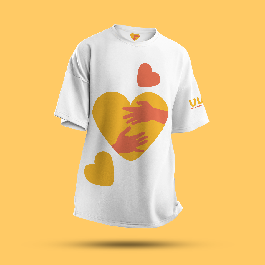
Logo on a T-shirt
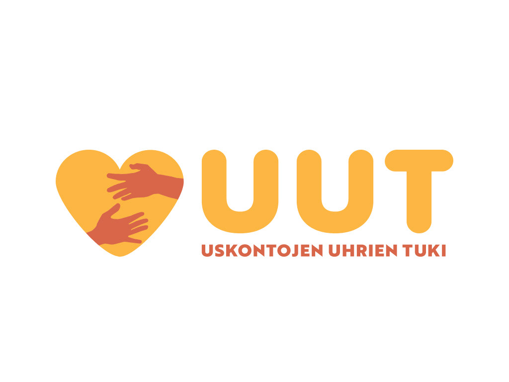
Main logo
Strength in peer support
Concept: The idea was to highlight the kindness and care associated with the organization's work. The organization's slogan is "Strength in peer support," (Vertaistuesta voimaa), and I wanted to bring this message to the forefront of the visual design.
Color Scheme: Warm tones convey empathy and care.
Metaphor: The heart shape and outstretched hands are strong and clear symbols of help and support.
Typography: The bold, rounded "UUT" gives the logo a friendly and approachable feel. The large, rounded letters also reference the organization's old logo.
Note: This is a hobby project born out of admiration to UUT's work.
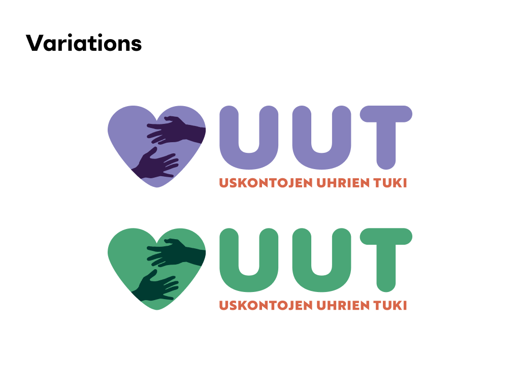
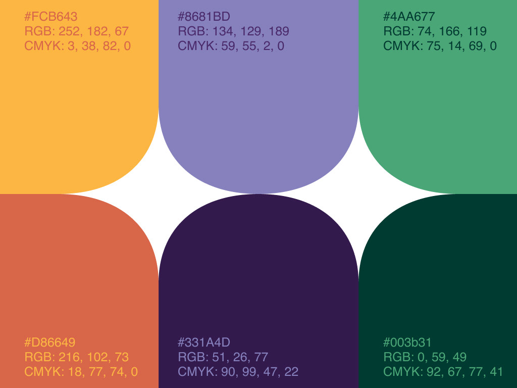
Color palette
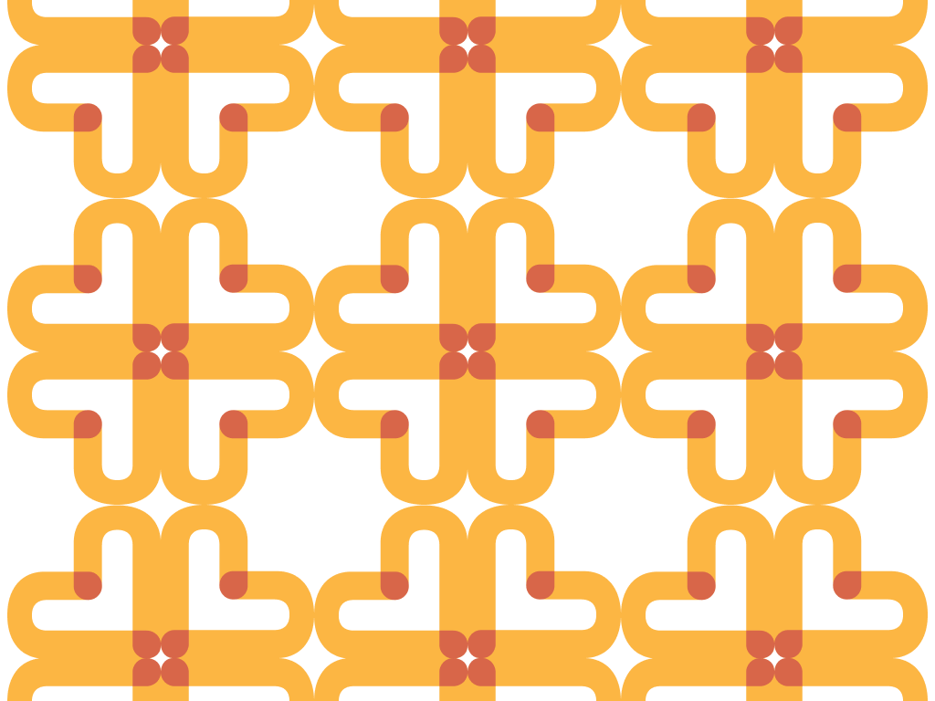
Hug patterns
The letter 'U' has been used as a symbol of human hands, and when joined together, they form a new symbol—a hug. This approach effectively communicates the idea of unity, connection, and support, continuing the theme of the logo.
Various hug symbols are created from the same letter 'U'. The points where the hands meet are highlighted with a deeper color, representing the strength of unity.
Various hug symbols are created from the same letter 'U'. The points where the hands meet are highlighted with a deeper color, representing the strength of unity.
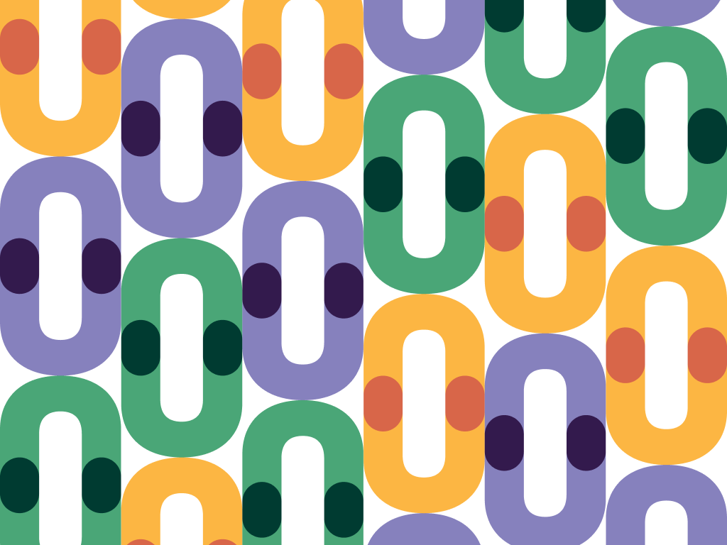
Hug pattern example 1
