"Theory" in the brand name inspired me to incorporate elements of science, emphasizing the thoughtfulness behind crafting each blend. After exploring various concepts, the final logo design draws on Greek letters used in STEM to reflect the brand’s innovative approach to tea.
The packaging builds upon the STEM concept of the logo by using a botanical illustration of the tea plant with arrows pointing at different parts of the plant. Except in this design, the role of the arrows is to show the flavor profile of the tea blend. The top arrow indicates the top notes, the middle arrow is for middle notes, and the bottom arrow for the finish.
The packaging builds upon the STEM concept of the logo by using a botanical illustration of the tea plant with arrows pointing at different parts of the plant. Except in this design, the role of the arrows is to show the flavor profile of the tea blend. The top arrow indicates the top notes, the middle arrow is for middle notes, and the bottom arrow for the finish.
All blends use the same botanical illustration, because all tea comes from the same plant - something I learned while researching for this project.
Tools used: Adobe Photoshop, Figma, Adobe Firefly.
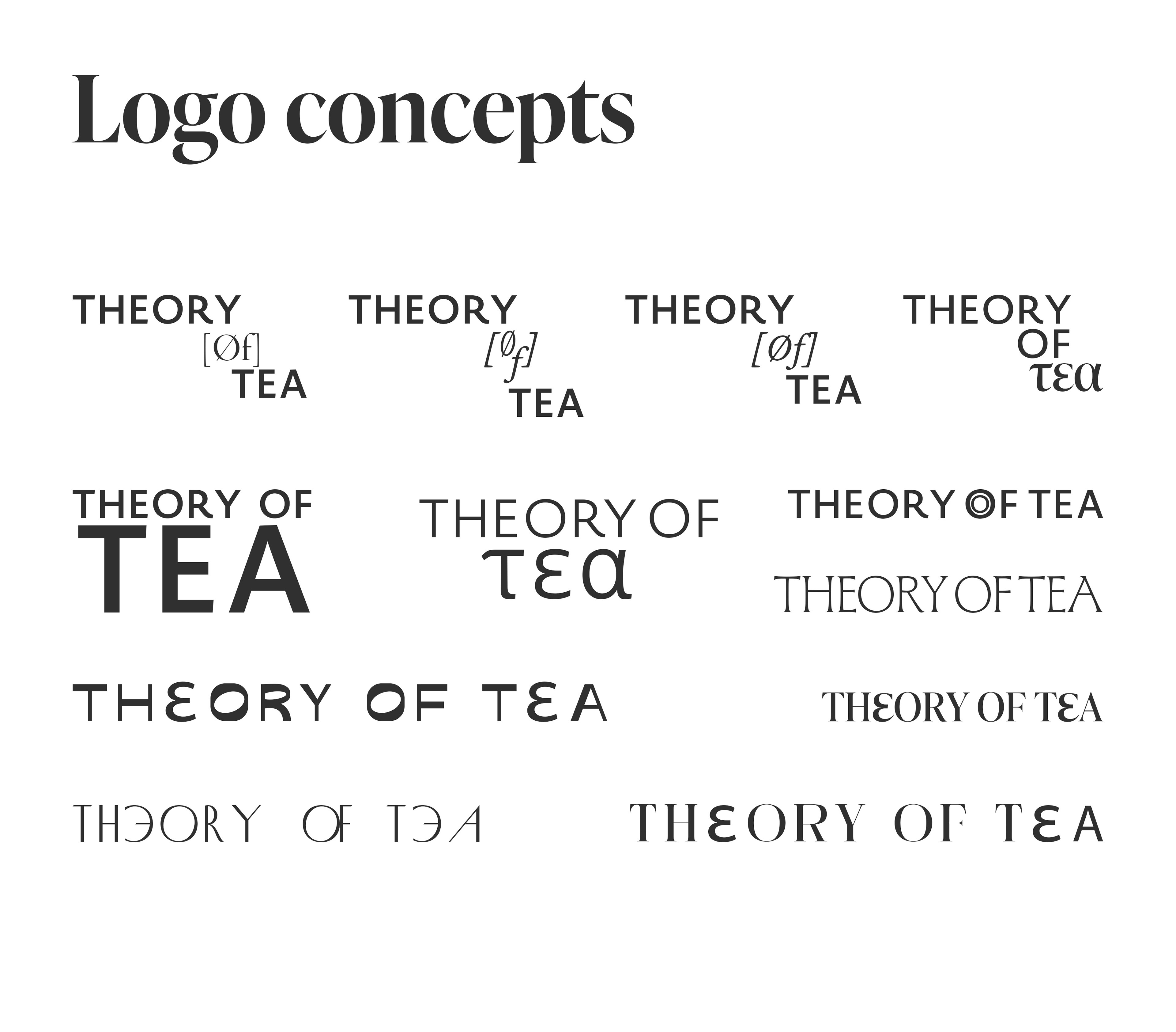
Logo concepts that I explored
